Rameen Ghafoor
UX STRATEGIST | UX RESEARCHER
Case Study: Driving Conversion Through Data-Led UX Audits
Key Takeaways
A data-driven UX audit exposed where our marketing site was losing high-intent visitors. By redesigning the homepage onboarding, mobile flows, and /docs/ CTAs ahead of KubeCon, we turned traffic spikes into adoption: visits grew ~40% and—based on B2B benchmarks (2.3–5.5% conversion)—even modest CTA engagement represents meaningful community growth.


🧠 Project Context
Our marketing site generated healthy traffic, but design and messaging decisions were based on assumptions. There was no clear picture of: - where users dropped off - what messaging resonated - whether CTAs were visible or clicked - how well the layout guided B2B visitors Goal: improve conversion and ROI by grounding landing-page design in user behavior.
🚀 My Role & Initiative
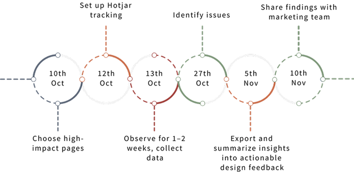
I proposed and led recurring UX audits every quarter. - Selected top-traffic pages - Deployed Hotjar (heatmaps, scroll maps, recordings) - Pulled GA + Looker Studio data - Consolidated insights into actionable recommendations for marketing & content teams
🛠 Tools
- Analytics: Hotjar, Google Analytics, Looker Studio, GTM - Design & prototyping: Figma - Reporting & comms: internal sheets, Slack
🧩 My Process & Product Ownership
I initiated a quarterly UX audit program to ground marketing and product decisions in real user behavior. Beyond analytics (Hotjar, GA, Looker Studio), I modeled site funnels and user journeys, gathered requirements from marketing, engineering, and leadership, and translated them into user stories and backlog items. I aligned each audit with business KPIs (traffic → activation → signup), prioritised recommendations with stakeholders, and presented findings in roadmap reviews to influence release planning. I also set up lightweight testing (heatmaps, recordings, UAT pilots) and created documentation & training so teams could adopt UX improvements consistently.
✍️ Key Insights Found
Through multiple audits, I uncovered critical usability issues and missed conversion opportunities. A few examples:
1. New Users Drop Off Quickly — Poor Onboarding
🧩Challenge:
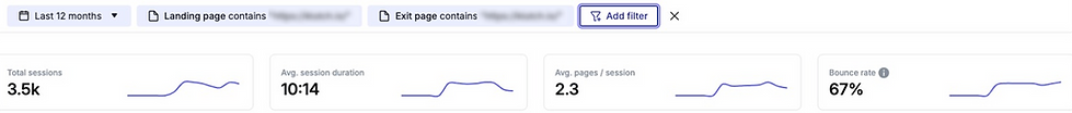
Analytics showed ~67% of new visitors bounced from the homepage without scrolling beyond the hero. The value proposition sat below the fold.

💡Solution:
- Introduce Lightweight Onboarding, helps orient users in the first 5–10 sec and reduce 67% bounce. - Refactor Homepage Hero Section: Make the value proposition immediate, visual, and bold. (headline + CTA above fold, clear subtext). Expected to lift engagement with key links
🎯 Expected Impact:
Making the value proposition immediate (above the fold) and adding a quick tour can reduce the current ~67% bounce among new visitors. Industry data shows above-fold CTAs and lightweight onboarding increase first-click engagement.

Information should be scannable and the most important actions visible immediately. (Nielsen Norman Group – Visibility of system status, Match between system and real world).

Principle of chunking(from Cognitive Psychology, applied in UX/UI design)
2. Mobile Users Are Highly Active But Confused
🧩Challenge:
- Mobile users perform more actions (17.5 avg) but have shorter sessions (~226s vs. desktop ~911s). - Behavior suggests UX friction or scanning due to poor layout or density
💡Solution:
- Introduce a sticky call-to-action on mobile: Provide a small, non-intrusive “Get Started / Sign Up” button that stays visible as users scroll, helping highly active visitors act at the right moment without hunting for a link. - Use accordion / expandable sections for long content: - Break dense pages into collapsible blocks so readers can scan quickly yet open details on demand — optimised for vertical scrolling.
🎯 Expected Impact:
Sticky mobile CTAs and accordion content patterns help high-intent mobile users act without friction.


- Users should always know the “next best step.” Minimise dead ends by providing clear onward paths. (Affordance & Signifiers – Don Norman).
- Show only what’s necessary at a given moment, reveal more detail as needed. Reduces cognitive load and helps mobile users manage dense information.
3. High-Intent Visitors Exit /docs/ Page — No Clear Next Step
🧩Challenge:
- /docs/ receives high mid-funnel traffic, mostly from desktop returning users (serious evaluators) - /docs/ received 192 exits vs 89 entries — most visitors arrived mid-journey and left without guidance. Adding a CTA could channel part of those 192 into signup, representing untapped opportunity. - No clear CTA or guidance after reading
💡Solution:
- Guide visitors who finish reading a topic toward the next step (e.g., Get Started, Request a Demo). This addresses the current “dead end” where ~192 users exit the page. - Improves orientation inside documentation and lets users discover related sections without losing their place. - Using B2B lead-gen benchmarks (LiveSession & HubSpot: 2.3–5.5%), I illustrated the size of the opportunity if we added contextual guidance.
🎯Expected Impact:
Adding contextual CTAs and related-content navigation can move docs-page visitors toward signup.

Using B2B lead-gen benchmarks (LiveSession & HubSpot: 2.3–5.5%), I illustrated the size of the opportunity if we added contextual guidance.

Consistency in navigation and interaction patterns lowers learning curves and reduces confusion. (Jakob’s Law of UX).
✅ Outcome & Impact
For this audit, conversion = visitors who, after viewing /docs/, click a primary call-to-action (‘Get Started’ or ‘Try Klutch’). Because the /docs/ page previously lacked a clear call-to-action, its conversion was effectively 0%. Using B2B lead-gen benchmarks (LiveSession & HubSpot: 2.3–5.5%), I illustrated the size of the opportunity if we added contextual guidance. After implementing the recommendations in time for KubeCon, page traffic rose by ~40% compared with baseline, and clicks on “Get Started” / GitHub roughly doubled. Community feedback confirmed that a clearer hero and well-placed CTAs made it easier to try Klutch, validating the forecasted improvement and demonstrating measurable impact from UX changes.- Improves orientation inside documentation and lets users discover related sections without losing their place. - Using B2B lead-gen benchmarks (LiveSession & HubSpot: 2.3–5.5%), I illustrated the size of the opportunity if we added contextual guidance.
🪞 Reflection
This project underscored how data-backed UX evaluation bridges marketing & product. - Next time I’d integrate small A/B tests to validate forecasts - Early stakeholder buy-in would accelerate adoption - I plan to introduce the same quarterly audit cadence, add a discovery phase for stakeholder goals before starting analysis, and build lightweight dashboards so teams could track adoption of UX recommendations over time
